Time-Series 101: Reading the Pulse of the World
Before you forecast the future, learn how to hear it. A 7-minute crash course in the core logic of time series analysis—lag, cycles, noise, and all.
What We’ll Cover
- What a time series really is, and why it’s different from other data.
- How time is modeled: time domain and frequency domain approaches, and their applications.
- The role of white noise as the building block of randomness.
- Time series smoothing and moving averages, and an introduction to correlation.
- The building blocks of forecasting: autoregression, random walks & trends, and signals.
We’ve got a lot to unpack — let’s begin!
1. What Is a Time Series?
Unlike traditional datasets that assume each data point is independent and identically distributed (i.i.d.), time series break that assumption.
In an i.i.d. setting, we assume:
Past values provide no information about the future — the process has no memory.
But in time series, we typically observe autocorrelation:
Future values depend on previous values — the system has memory.
This motivates models of the form:
Where is a function (linear in AR models, non-linear in neural nets) and is noise (called white noise).
This makes time series harder to model, but also richer to understand — because there’s structure across time waiting to be captured.
Two Approaches to Modeling Time
When working with time series data, there are two core ways to model time. Each provides a different lens.
1. Time Domain Approach. Here we examine the influence of past values on the present — what’s called a lag structure. It’s about memory: how much does today depend on what came before?
A classic example is forecasting daily COVID-19 cases using past data. If you’re analyzing Barcelona’s case history, the number of cases reported 7 days ago may strongly predict today’s count — this is known as a 7-day lag.
Of course, how do we choose the right lag? Later in the series we’ll explore this using tools like the Autocorrelation Function (ACF) to identify meaningful temporal dependencies, especially useful during outbreak phases.
Below is a simple forecasting example using a GRU (Gated Recurrent Unit), a type of recurrent neural network (RNN) designed to model sequential patterns over time. We train it on a 7-day sliding window of past COVID-19 case counts to predict the next day’s value.
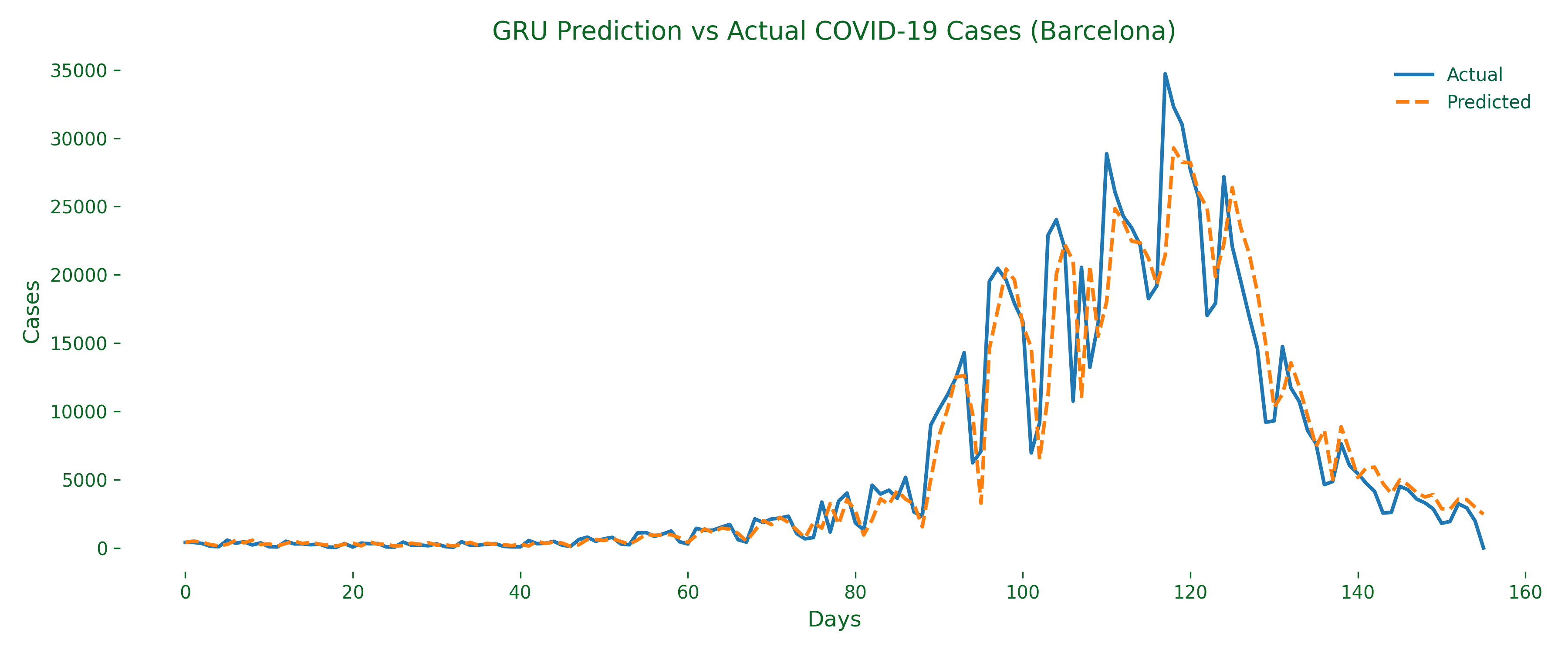
A sliding window simply means we look at a fixed number of past days (here, 7), then shift the window forward by one day for each training example. If today is day 10, we use days 3–9 to predict day 10, and repeat this pattern throughout the series.
All the examples in this post live in a public GitHub repo — Time-Series-101.ipynb — with complete code, helper functions, and saved figures, shared under the MIT license to encourage learning and reuse.
2. Frequency Domain Approach. While the time domain asks “how does yesterday affect today?”, the frequency domain asks a different question: are there hidden rhythms or repeating patterns over time?
Instead of lag-based memory, we zoom out and study how often certain fluctuations repeat — weekly, monthly, or per minute depending on the application. This is especially helpful for seasonal or behavioral patterns (testing dips on weekends, reporting surges on Mondays).
To reveal these cycles, we use the Fast Fourier Transform (FFT) — a mathematical tool that decomposes a signal into its frequency components. If a pattern repeats every 7 days, the FFT shows a sharp spike at period = 7.
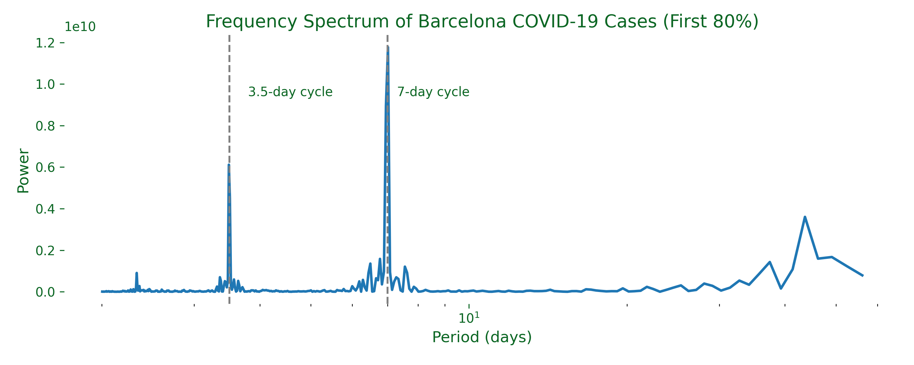
We first applied a Hamming window to smooth the edges and reduce noise artifacts, then filtered out extremely long periods (over 60 days) for clarity. The resulting spectrum reveals a clear 7-day cycle — a recurring pulse likely tied to weekly testing and reporting behavior. There’s also a smaller spike around 3.5 days, which could reflect sub-weekly rhythms or statistical noise.
This frequency-based perspective complements the time-domain approach beautifully. It’s less about predicting tomorrow, and more about understanding the seasonality and periodic nature of real-world time series.
2. White Noise: An Introduction
Before modeling real-world signals, it’s crucial to understand what true randomness looks like — and in time series analysis, that’s white noise.
What Is White Noise?
White noise is a sequence of random variables that represents pure randomness. It serves as the baseline for unpredictability: any model that cannot outperform white noise hasn’t truly learned anything useful. It has three defining properties:
- Zero mean: the expected value is 0 —
- Constant variance: the spread stays stable over time —
- No autocorrelation: past values give no clue about future ones — for all
In short, white noise is the reference signal we measure against. Any predictive model should aim to beat this baseline — otherwise it’s just a coin toss.
Three Flavours of White Noise
We often distinguish between increasing levels of statistical independence:
1. White Noise (WN). Exactly the definition above. It can be sampled from any distribution, as long as values are uncorrelated.
2. IID Noise. All white-noise properties, plus independent & identically distributed: each is drawn independently — . For example, you might draw from a uniform distribution.
3. Gaussian White Noise. All IID properties, plus a Gaussian distribution: samples are drawn from a normal distribution — .
Here’s why Gaussian/normal distributions are special:
Correlation vs. Independence
I’ve been throwing around terms like correlation and independence — but what do they actually mean, and is there a difference?
- Correlation captures linear relationships. Two variables can be uncorrelated but still dependent in non-linear ways.
- Independence is a stronger condition: knowing one variable tells you nothing about the other, not even in complex or non-linear forms.
Example: uncorrelated but dependent. Let with equal probability, and define . Although and have zero correlation (since is symmetric around 0 and has a non-linear relationship with ), there is still a clear dependency: is a deterministic function of .
| Concept | Formal definition | Implies independence? |
|---|---|---|
| Uncorrelated | Not always — they could still be dependent | |
| Independent | Yes | |
| Gaussian case | jointly Gaussian & uncorrelated | Then also independent |
Simulating White Noise
I simulate 200 samples for each of the three flavours (plain white, IID, and Gaussian). You’ll see how each differs subtly in structure and randomness:
np.random.seed(42)
n = 200
sigma = 1

# 1. White Noise (WN): zero-mean, constant variance, uncorrelated — any distribution
# w_t = (-1)^t * z_t
white_noise = ((-1) ** np.arange(n)) * np.random.normal(0, 1, size=n)

# 2. IID noise: same as WN, but can use a non-Gaussian distribution
iid_noise = np.random.uniform(-1, 1, size=n)

# 3. Gaussian White Noise: WN + Gaussian + IID
gaussian_white_noise = np.random.normal(0, 1, size=n)
A recap of the three flavours:
- White Noise (WN): where . Zero mean, constant variance, and uncorrelated due to the alternating sign — but not IID, since the introduces deterministic structure that violates independence.
- IID Noise: . Each value drawn independently from a uniform distribution — valid IID noise, but not necessarily Gaussian.
- Gaussian White Noise: . Independent, identically distributed, and drawn from a normal distribution.
Let’s visualize all three:
fig, axs = plt.subplots(3, 1, figsize=(10, 8), sharex=True)

axs[0].plot(white_noise, color="#2e7d32")
axs[0].set_title("White Noise (WN): ~ N(0, 1)")

axs[1].plot(iid_noise, color="#3366cc")
axs[1].set_title("IID Noise: Uniform(-1, 1)")

axs[2].plot(gaussian_white_noise, color="#cc2277")
axs[2].set_title("Gaussian White Noise: IID ~ N(0, 1)")

plt.tight_layout()
plt.show()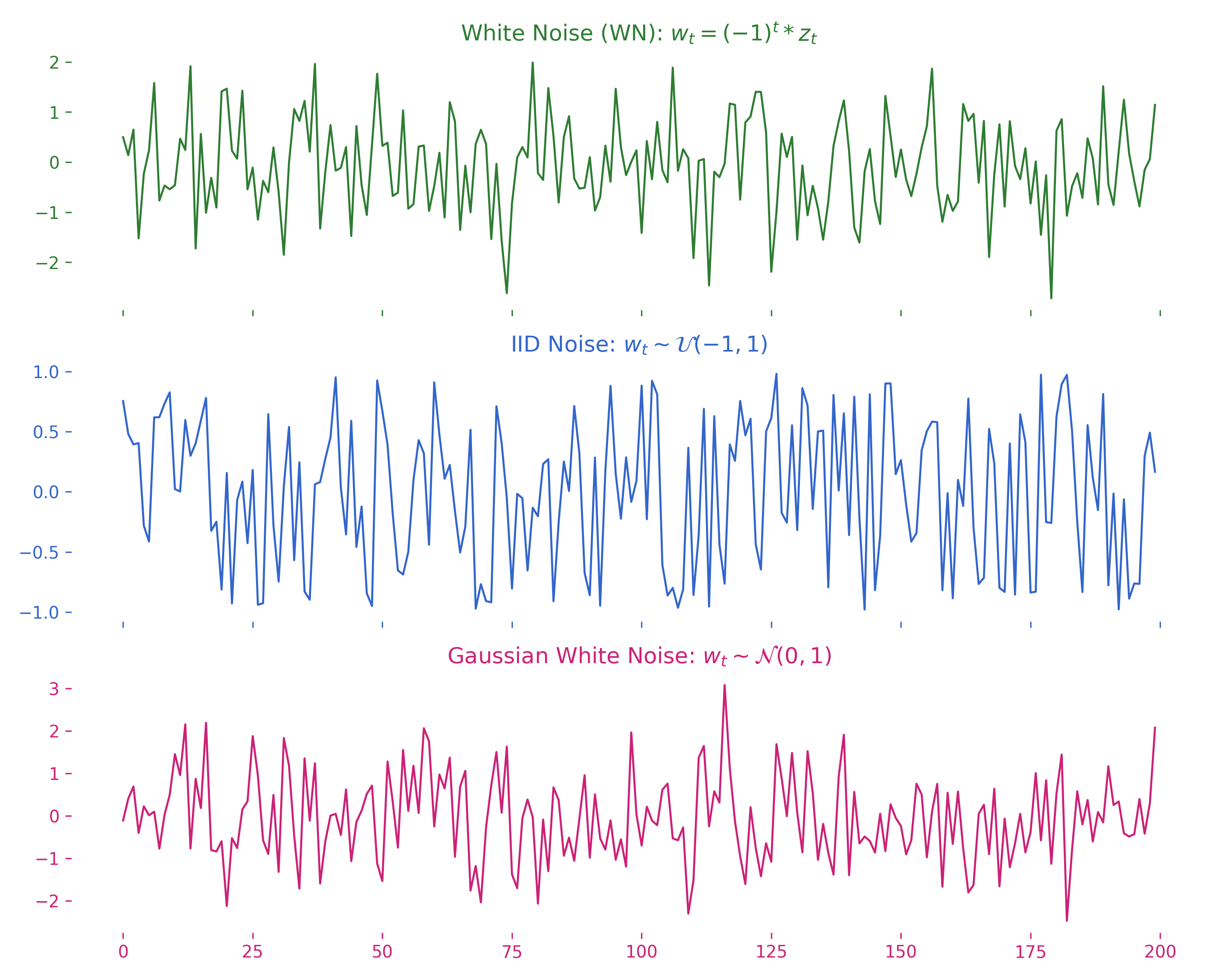
At first glance, these three signals might all look like random wiggles — and that’s fair. But underneath that apparent randomness lie fundamental differences in their statistical properties. These distinctions aren’t just academic; they shape how models interpret time series data, whether it’s an ARIMA model or a deep learning architecture.
Summary
| Type | Distribution | Independence | Gaussian? |
|---|---|---|---|
| White Noise (WN) | Any | Not required | No |
| IID Noise | Any | Yes | No |
| Gaussian White Noise | Normal | Yes | Yes |
White noise may seem trivial, but it defines the baseline. Our goal in modeling is to find signals that are more predictable than this.
3. Moving Averages: Smoothing the Chaos
White noise is statistically well-behaved — mean 0, constant variance, no memory. But what happens when we try to smooth it out?
First, what do smoothing and moving average mean?
A moving average is the most basic form of smoothing, where each value is replaced by the average of its neighbors. Here’s a 3-point moving average:
When you average over time, each new value partially depends on the values before it. That gives the illusion of a signal, even if none existed to begin with.
Let’s see how our Gaussian white noise looks after a 13-point moving average:
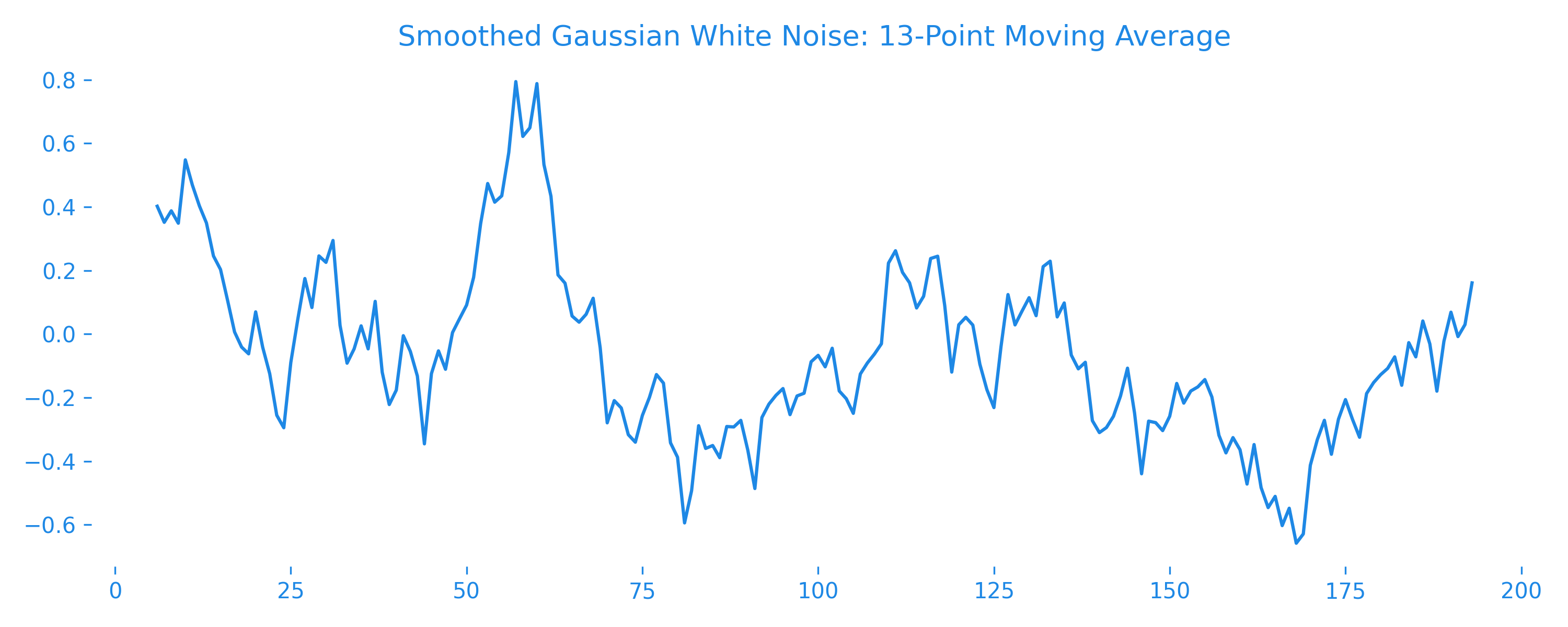
Notice how it looks smoother, more “structured”? That’s correlation sneaking in. Moving averages are used for trend extraction, noise reduction, and as building blocks in models like MA(q) and ARIMA.
4. Autoregression: Memory Enters the Scene
White noise has no memory. But what if we gave it one?
An autoregressive (AR) process models the current value as a linear combination of past values:
This means today’s value depends partially on yesterday’s value, with some added randomness. Let’s generate a simple AR(1) process and visualize it:
np.random.seed(42)
phi = 0.8
n = 300
ar = np.zeros(n)

# Generate AR(1) process
for t in range(1, n):
    ar[t] = phi * ar[t - 1] + np.random.normal()

plt.figure(figsize=(10, 4))
plt.plot(ar, label=f"AR(1) with phi={phi}")
plt.title("Autoregressive Process AR(1)")
plt.xlabel("Time")
plt.ylabel("Value")
plt.legend()
plt.grid(True)
plt.show()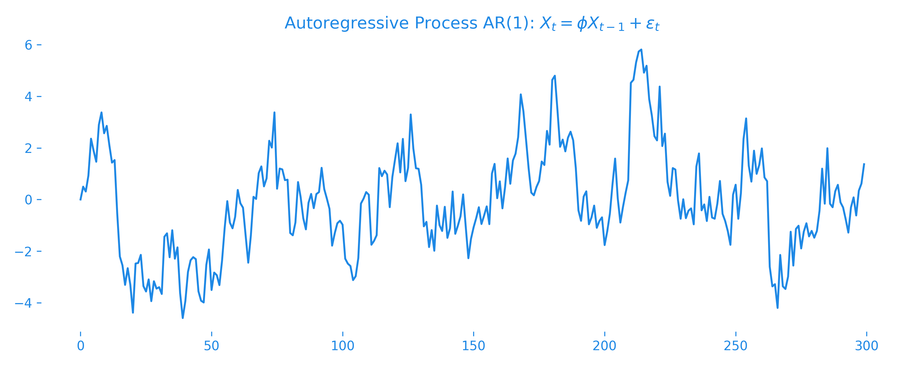
Now the plot feels different. It has inertia. This is what makes autoregression so powerful: it helps the model remember.
5. Random Walks with Drift: The Illusion of Trend
Some time series appear to have a trend — they keep rising (or falling) steadily. But sometimes this is just a clever illusion caused by a random walk with drift.
Imagine a process where each step depends on the previous one, plus a small bias and some noise:
Here, is the drift — a constant that nudges the series in one direction over time. Even if the noise has zero mean, this drift can create the illusion of a meaningful upward (or downward) trend.
n = 300
delta = 0.2  # Drift term
np.random.seed(42)
noise = np.random.normal(0, 1, size=n)

random_walk = np.zeros(n)
for t in range(1, n):
    random_walk[t] = random_walk[t - 1] + delta + noise[t]

fig, ax = plt.subplots(figsize=(10, 4))
ax.plot(np.arange(n), random_walk, color="#e65100", linewidth=1.5)
ax.set_title("Random Walk with Drift")
plt.tight_layout()
plt.show()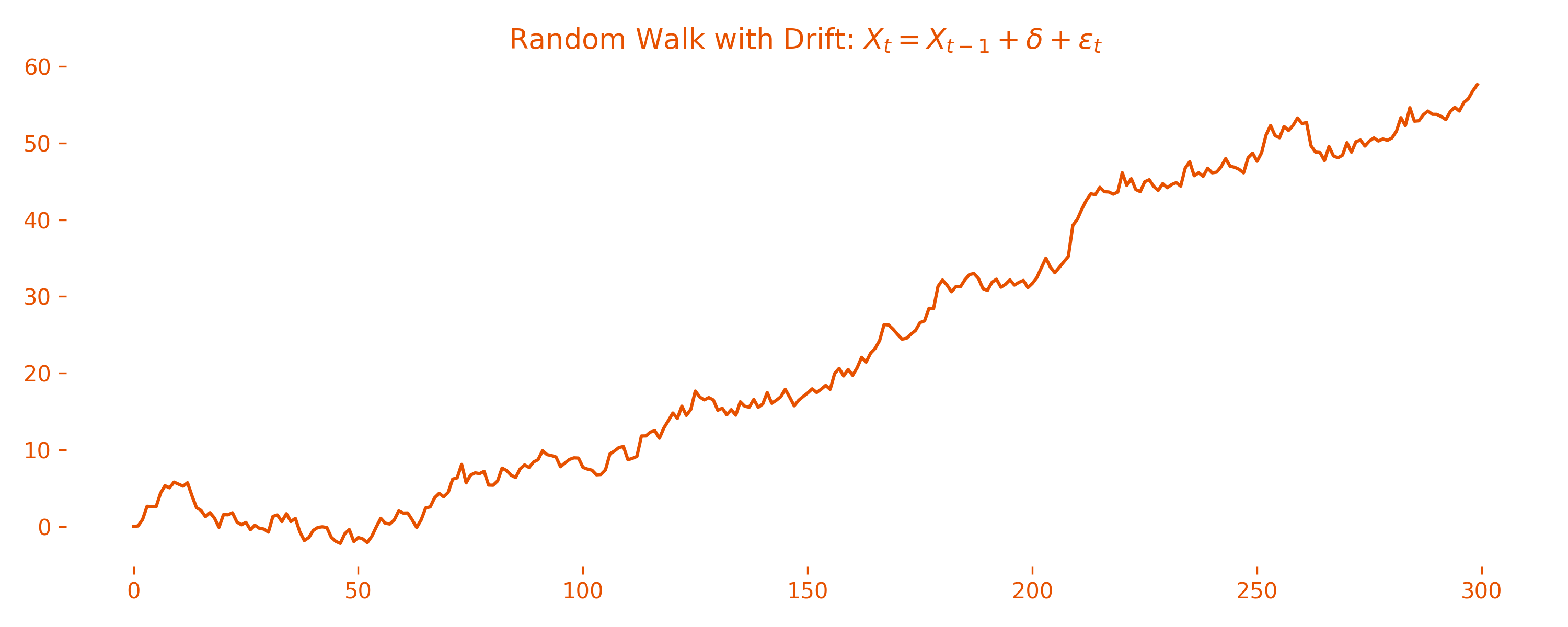
Looks like a trend, right? But beware: this isn’t a stationary process. Its mean and variance change over time, which breaks many modeling assumptions and makes such processes hard to forecast reliably. In fact, many financial time series behave like this — fooling novice forecasters daily.
6. Signal in Noise: Can You Hear It?
Suppose we now add white noise to a clean signal, like a cosine wave. Suddenly, detecting the true pattern becomes a challenge.
A = 2                   # Amplitude
omega = 5               # Frequency (Hz)
phi = np.pi / 4         # Phase shift (radians)
t = np.linspace(0, 1, 1000)
np.random.seed(42)

signal_clean = A * np.cos(2 * np.pi * omega * t + phi)
noise_05 = np.random.normal(0, 0.5, len(t))
signal_noisy = signal_clean + noise_05
We simulate a clean periodic signal — a cosine wave with fixed amplitude, frequency, and phase — then add Gaussian white noise with standard deviation to observe how the signal gets distorted.
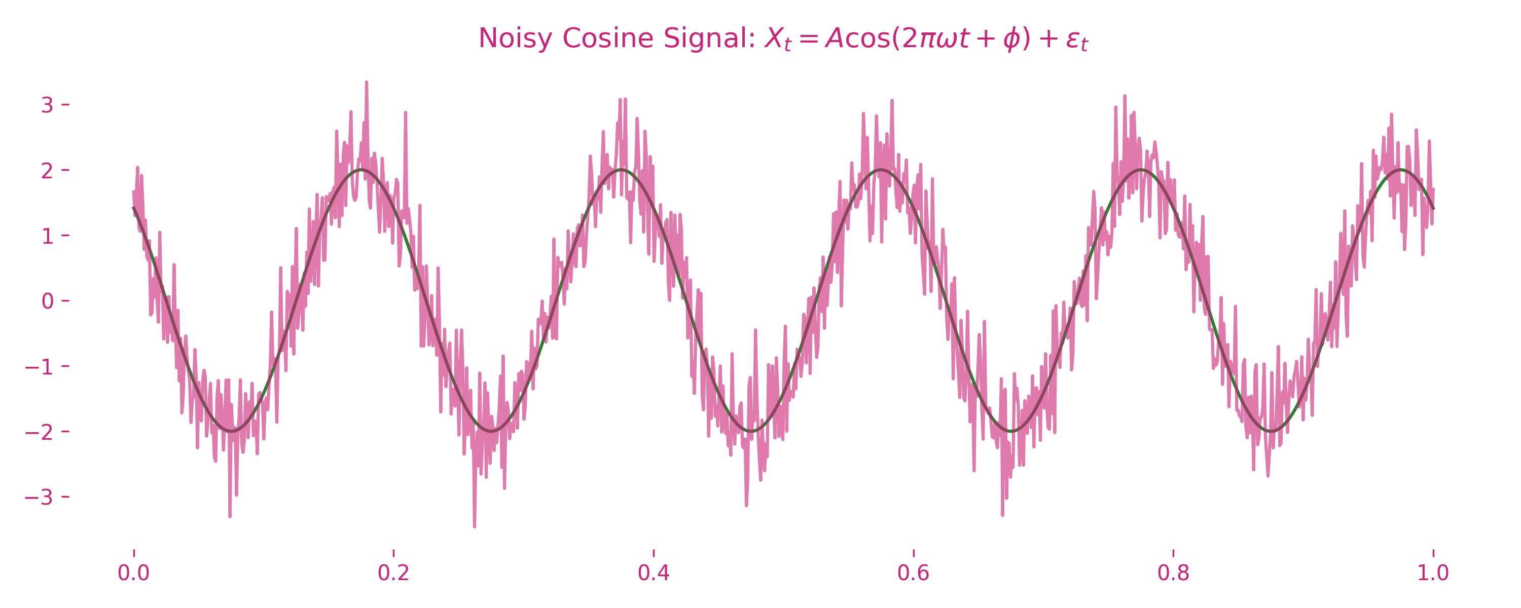
The clean curve represents the ideal underlying signal where , , and . The noisy curve shows the same signal contaminated with white noise — visually, it becomes much harder to distinguish the wave’s structure.
This highlights a critical challenge in time series analysis: separating signal from noise. In the real world, we rarely observe the true signal in isolation — it’s always buried in uncertainty. That’s where time series analysis becomes more art than science.
Coming Up Next
This post was just the prologue — a gentle entry into the world of time series. You’ve now met the foundational building blocks:
- White Noise — the benchmark of randomness
- Moving Averages — the art of smoothing chaos
- Autoregression — injecting memory into the past
- Random Walks — when noise becomes a deceptive trend
- Signal + Noise — learning to see the pattern beneath the clutter
In the next post, we’ll deepen the toolkit by:
- Measuring memory using the Autocorrelation Function (ACF)
- Understanding what makes a process stationary, and why it matters
- Decomposing a real-world time series into its trend, seasonality, and residual
After that? We’ll move from foundations to foresight, and begin the real journey of forecasting.
Time to move from theory… to timelines.