Patterns that Persist: Stationarity, Correlation, and Trend Detection
A practical guide to testing stationarity, interpreting autocorrelation, and decomposing time series into trend, seasonality, and noise - essential steps for robust forecasting and model selection.
What We’ll Cover
- What stationarity means and why it’s crucial for modeling.
- Different flavours of stationarity: strict, weak, trend, and difference stationarity.
- How to measure time-based dependence: autocovariance and the Autocorrelation Function (ACF).
- Interpreting ACF plots and judging significance with standard-error bands.
- Breaking a series into trend, seasonality, and residuals — plus basic trend detection with regression.
We’ve got a lot to unpack — let’s begin!
1. What Does Stationarity Mean?
Before you build any time series model, you have to ask a simple question: does this data behave consistently over time? If the answer is yes, you’re likely working with a stationary process, and your life will be easy. If the answer is no, your forecasting models will fumble more than your university outfits. Buckle up — this is about to get serious.
Informally, a stationary time series keeps its basic properties steady over time:
- The average level stays constant.
- The spread (variance) doesn’t widen or shrink.
- The way it relates to its past values doesn’t change. (Think of it this way: the correlation between Wednesday and Monday should be the same as between Tuesday and Sunday. Cool, right?)
Think of it like weather in a mild climate: daily temperatures go up and down, but the overall pattern doesn’t drift endlessly hotter or colder.
Formally, a time series is called weakly stationary if it satisfies these three conditions:
- The expected value (mean) is constant over time — at any point , the variable is drawn from the same distribution with mean .
- The variance is constant and finite — the spread of possible values doesn’t change as you move along the time axis.
- The covariance between any two points depends only on their separation (the lag ), not where they are in time — the relationship between and is the same as between and if the lag is 5.
These conditions ensure that the statistical properties you estimate from a sample don’t drift or explode over time — a key requirement for many forecasting models to perform reliably.
Two Familiar Examples, Proved Stationary
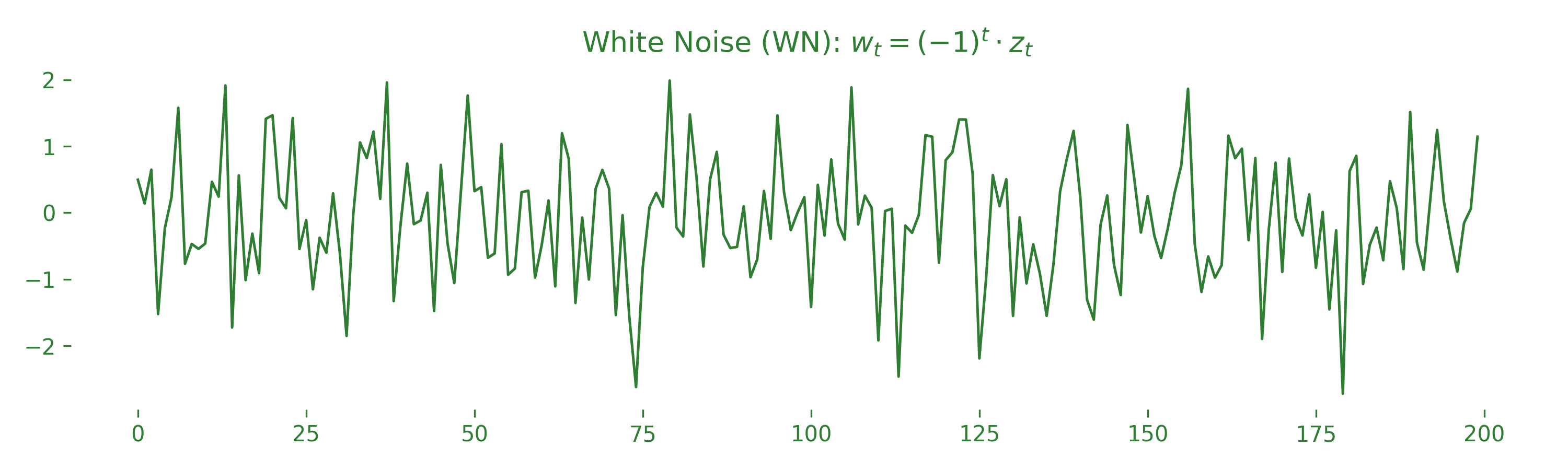
Stationary Example 1 — White Noise. As discussed in the introductory time series post, white noise satisfies:
The mean is zero, the variance is constant, and each value is uncorrelated with the others — meaning it’s perfectly stationary. You can see this visually below: the plot jumps around randomly without drifting up or down, and the spread stays uniform.
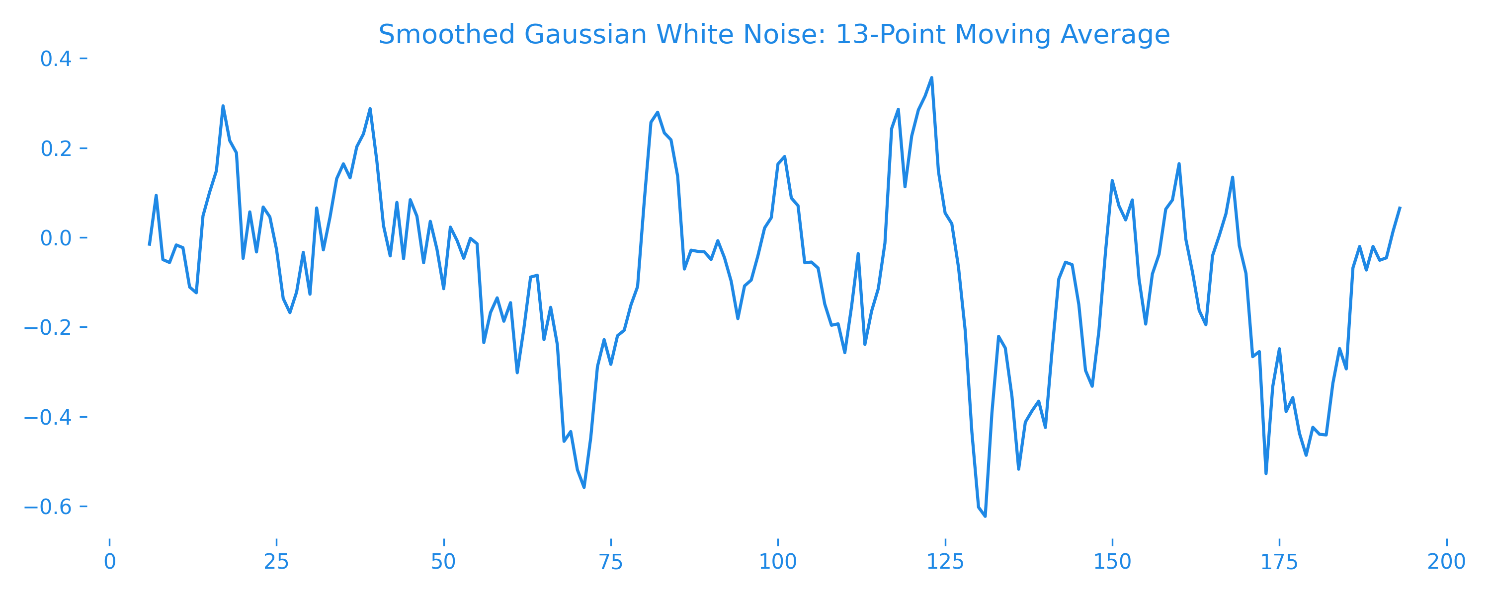
Stationary Example 2 — Moving Average. A simple moving-average (MA) process smooths white noise by averaging it with its neighbors. Using a window of three values:
Step 1 — the mean:
Step 2 — the variance:
(the middle step uses since the terms are uncorrelated). So the mean is zero, the variance is constant, and the covariance depends only on lag — satisfying weak stationarity. Visually, the series stays centered around zero with a stable spread. Unlike pure white noise, nearby points move together more smoothly — they’re slightly correlated.
Non-Stationary Example — Random Walk with Drift. A random walk with drift accumulates both random shocks and a consistent trend:
where is a constant drift term and is white noise.
Step 1 — the mean grows linearly over time:
Step 2 — the variance increases with time:
So the mean is not constant and the variance grows indefinitely — violating stationarity. Visually, the series doesn’t hover around a stable average but drifts upward due to the constant trend, and the spread widens over time.
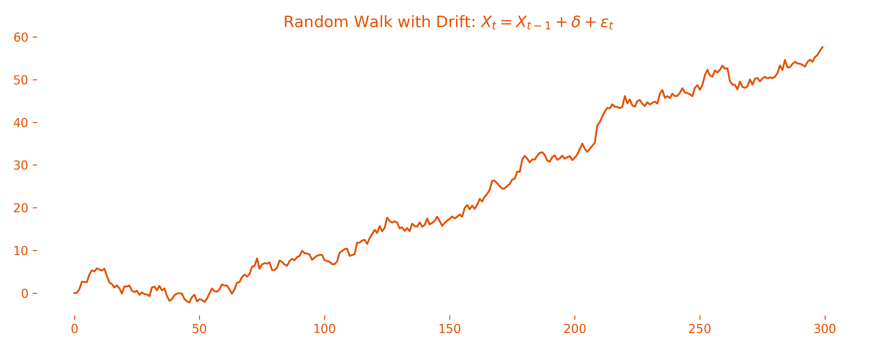
So how do you tell if a series is non-stationary in practice? Look for telltale signs in a plot: an obvious upward or downward trend, or a spread that gets wider or narrower. Many real-world signals (like stock prices) show these traits. Later, we’ll see how to transform them into a stationary version you can safely model.
2. Different Flavours of Stationarity
Not all stationarity is created equal. Statisticians love to label things, so you’ll come across different flavours: strict stationarity, weak stationarity (usually the crowd favourite), trend stationarity, and difference stationarity.
1. Strict Stationarity. The strongest flavour. Formally, a time series is strictly stationary if its entire joint probability distribution does not change when shifted in time — the full statistical behavior, not just mean or variance, stays identical for any collection of values and its time-shifted version:
While beautiful in theory, strict stationarity is rare in the real world and often too strong to verify — so we usually settle for weaker conditions. (Side note: white-noise and moving-average series are strictly stationary.)
2. Weak (or Second-Order) Stationarity. The most practical and commonly assumed form. Formally, is weakly stationary if:
The mean and variance are constant, and the covariance depends only on the lag , not the actual time points. This is not the same as strict stationarity: strict stationarity doesn’t even mention lags — it requires the entire joint distribution to stay the same when shifted. So weak stationarity checks a few moments (mean, variance, lagged covariance), while strict stationarity guarantees the whole probabilistic structure is invariant. Most statistical models (like ARMA) assume weak stationarity because it’s practical to check and holds for many real-world signals after pre-processing.
3. Trend Stationarity. Sometimes a series shows a clear deterministic trend — a line that steadily goes up or down — but its deviations around that line behave in a stationary way:
where is the deterministic trend and is a stationary noise process (it doesn’t have to be noise — any stationary process is fine). All the non-stationarity comes from the predictable trend, not the noise itself. Below, the green curve is a trend plus noise, and the dashed blue line shows the underlying trend. Removing that line leaves behind only the stationary wiggles (full code on the Blog GitHub repo):
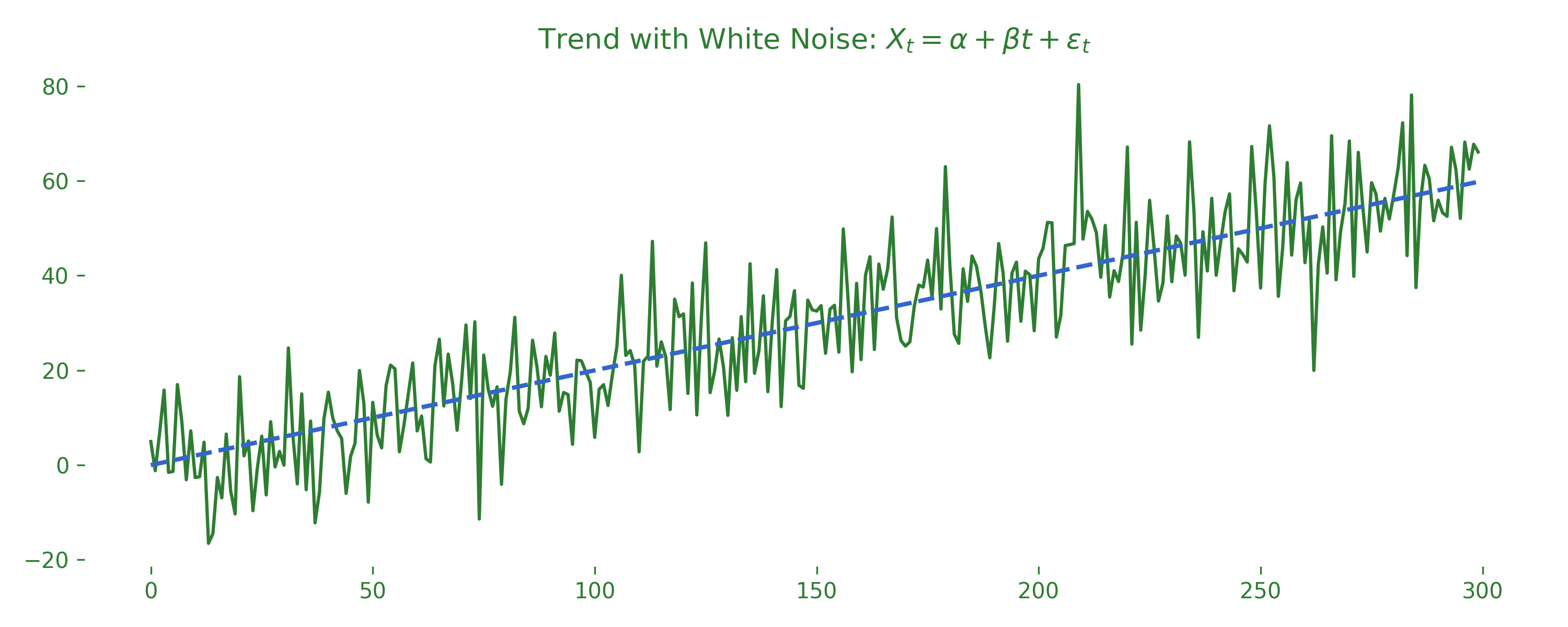
If you remove the trend (for example, by fitting a linear regression and subtracting the fitted line), the remaining residuals are stationary. This lets you model and forecast the stable part without being misled by the trend.
4. Difference Stationarity. Here the series itself is not stationary but becomes stationary once you take the difference between consecutive values. For a simple random walk , the series is not stationary, but its first difference is:
which is just white noise — stationary. This is the principle behind ARIMA models: they difference non-stationary series until they’re stable enough to model. Does the same hold with drift? If , then , which is still stationary (constant mean and variance). In practice, you test for weak stationarity, and if it fails, you difference or detrend the data to force it to behave.
3. Measuring Time-Based Dependence: Autocovariance, Autocorrelation & ACF
Now that you know what it means for a series to be stationary, the next big question is: assuming a series is weakly stationary (from here on I’ll just say “stationary”), how do we measure how past values relate to future ones? The tools are the autocovariance and autocorrelation functions.
1. Autocovariance Function (ACV). For a stationary series with mean , the autocovariance at lag is:
This measures how much two points steps apart move together:
- If , the values are uncorrelated at lag — no linear predictability at that distance.
- If , when one value is above the mean, the other tends to be above too.
- If , when one value is above the mean, the other tends to be below — anti-correlation.
2. Autocorrelation Function (ACF). The ACF standardizes the autocovariance to a scale of −1 to 1, which makes it easier to interpret:
So by definition (autocovariance at lag 0 is just the variance), and shows the strength and direction of linear dependence at lag . In practice, we estimate it from data using the sample autocorrelation function (note the sample mean ):
The ACF plot is a crucial tool: it visualizes across many lags. Spikes that stand out beyond the “confidence bands” hint at significant time dependence. But what are confidence bands, and how do we calculate them? That’s answered in Section 4.
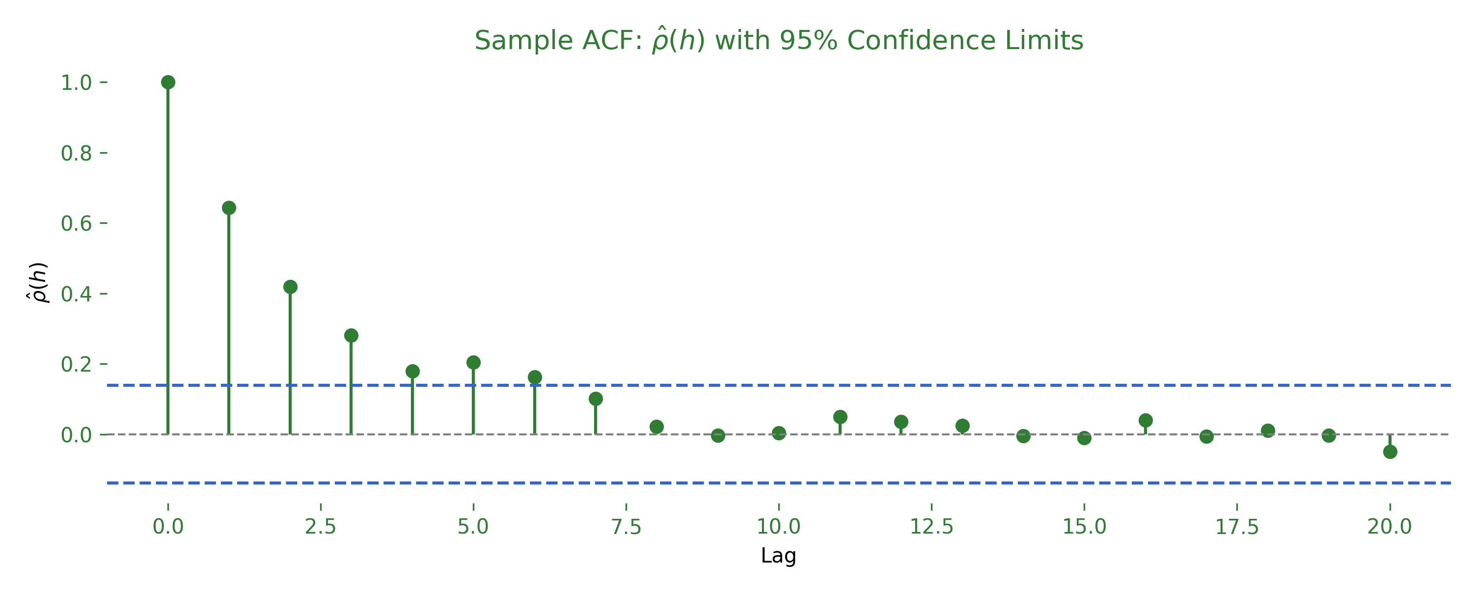
If you can guess the 95% confidence limits correctly, contact me on LinkedIn — you’ll get a present (find the answer below in Section 4).
3. Cross-Covariance (CCV) and Cross-Correlation (CCF). So far we’ve measured how one series relates to its own past. What if you have two series, and , and want to know how they move together across time? The cross-covariance is:
It measures how a value in at time relates to a value in at time . Positive lags mean follows ; negative lags mean leads . The cross-correlation standardizes this:
The CCF plot helps check if two series are linearly related with a lead-lag structure — does sales volume today predict stock price tomorrow? Does human mobility yesterday affect COVID-19 case counts tomorrow? But be careful: both series must be at least weakly stationary, and with real-world data that’s rarely the case!
In practice, these functions are your eyes into temporal structure. Before building AR, MA, ARMA, or ARIMA models, you inspect the ACF and CCF plots to detect lags, hidden relationships, or the need for differencing.
4. Interpreting ACF Plots & Judging Significance
You’ve seen how the ACF lays out at successive lags. But which spikes really matter? When is an autocorrelation at lag significantly different from zero, and not just random noise?
1. Sampling variability — the rule-of-thumb band. The standard error of gives a confidence band:
If the series is white noise, every spike falls inside those dashed lines about 95% of the time. A spike that pokes outside is evidence of linear dependence at that lag — there’s only about a 5% chance it happened by random chance if the series were pure white noise.
⚠️ Keep in mind: this band is exact only for pure white noise. Real-world data usually has genuine autocorrelation, so it’s normal to see spikes breach the band. Those out-of-band spikes highlight lags that contribute useful structure — assurance that a spike exceeding the interval at lag is most likely meaningful.
2. Reading an ACF at a glance.
- Tails off slowly (many lags stay high) → a non-stationary series with a possible trend or unit root. Fix: difference until the tail drops off quickly.
- Sharp cutoff after lag → the classic footprint of a pure MA(q) process. Beyond lag , it’s just noise.
- Strong seasonal spikes at lag → repeating cycles (like a 7-day bump for weekly sales). Your clue to include seasonal terms.
One small but crucial point: the ACF at lag zero is always exactly 1, because you’re correlating the series with itself — dividing the variance by itself, . That’s why every ACF plot starts with a spike pinned at 1; it’s the benchmark for comparing structure at other lags.
5. Unpacking a Real-World Series: Trend · Seasonality · Residual
Ready to leave pure theory behind? Let’s dissect an honest-to-goodness real-world dataset and watch the hidden pieces fall apart: trend, seasonality, and leftover random wiggles. We’ll finish by catching the trend with a one-line regression.
Dataset of choice: the classic AirPassengers series (monthly airline passengers, 1949–1960). Why? It has:
- Trend: commercial aviation exploded post-WWII.
- Seasonality: holiday peaks every 6–12 months.
- A dash of noise so it feels real.
1 · Look at the raw signal first.
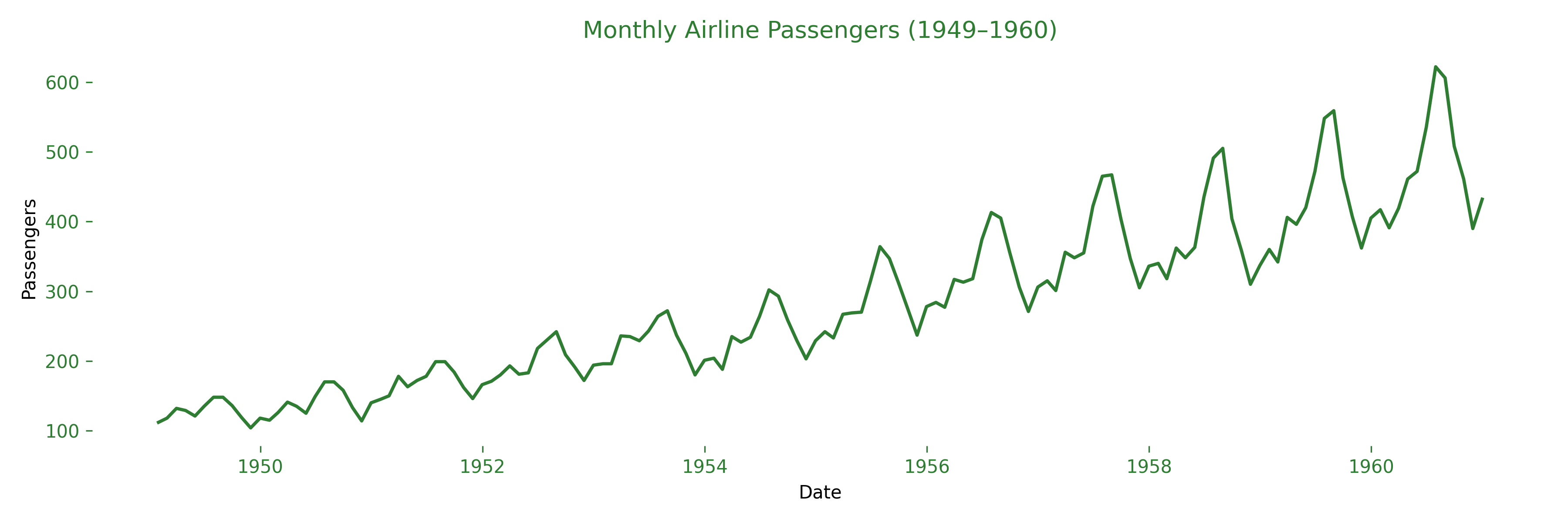
Even without stats you can spot a steady climb (trend) and saw-tooth holiday bumps (seasonality).
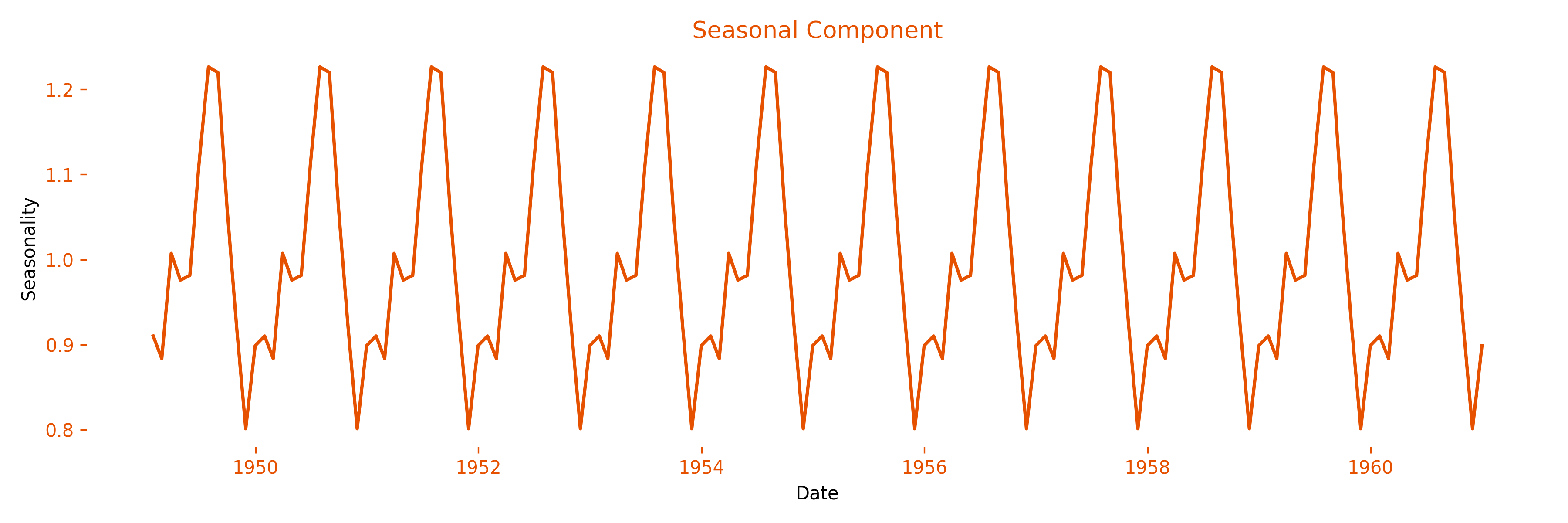
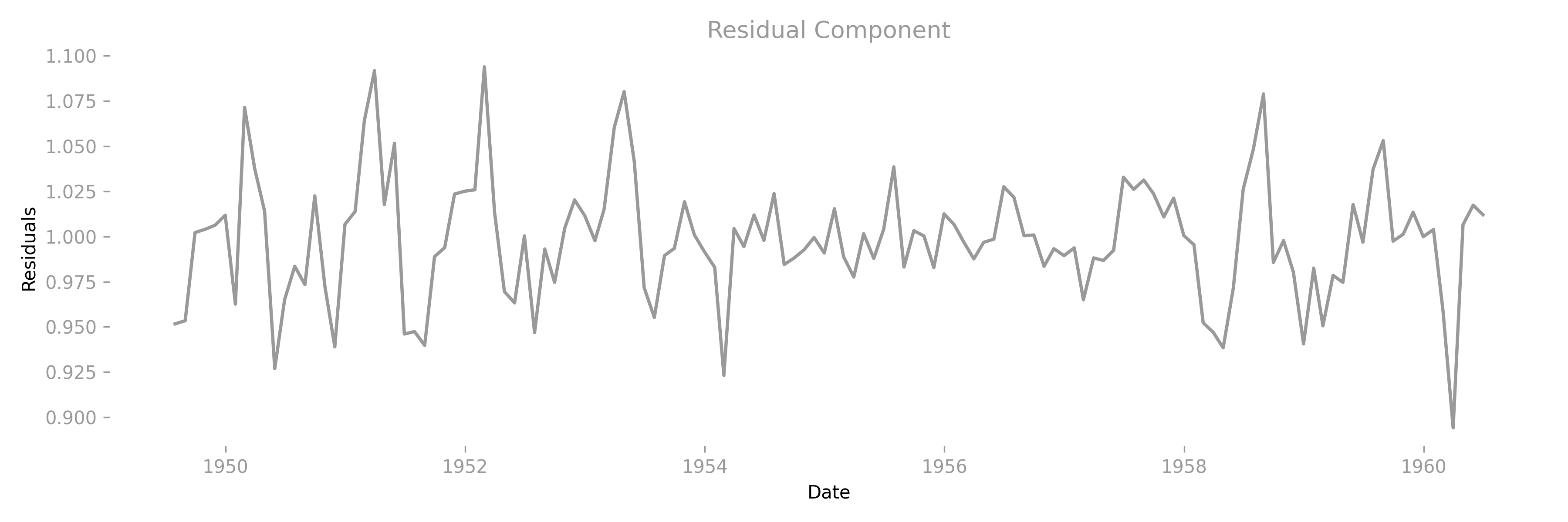
2 · Seasonal decomposition (multiplicative). We break the series into three building blocks using a multiplicative model, so the seasonal amplitude grows with the trend — perfect for airline data.
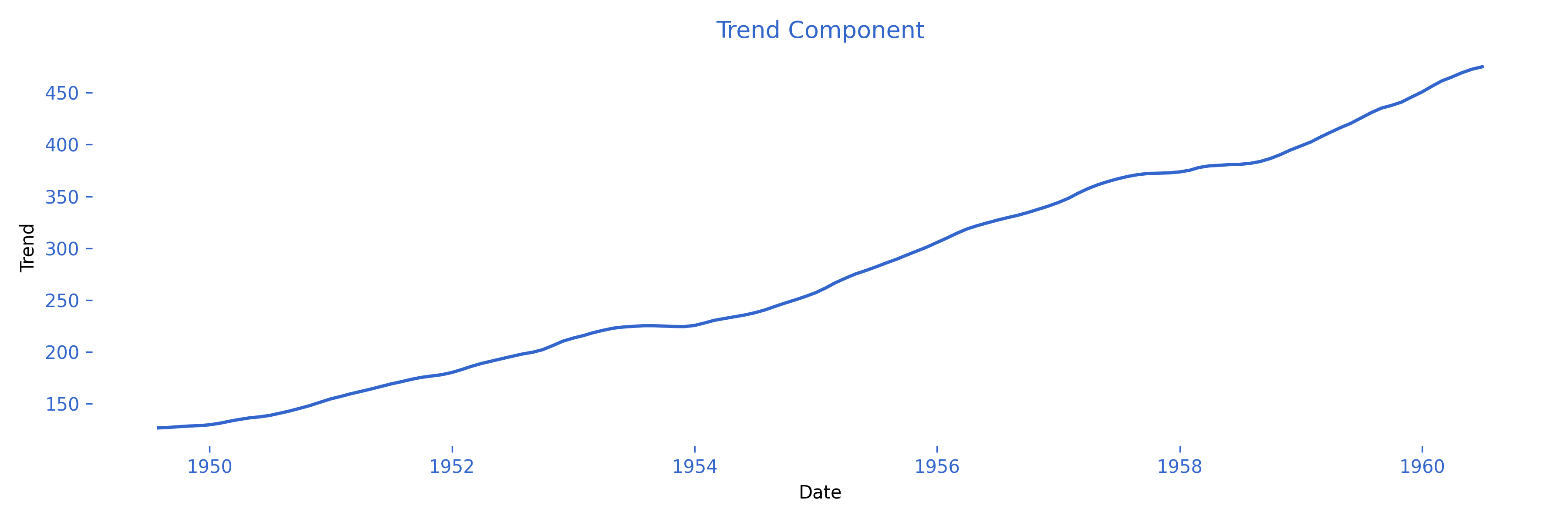
3 · A one-line regression to catch the trend.
Fitting an OLS line (Ordinary Least Squares — we’ll explore this and the Gauss-Markov theorem next post, stay tuned):
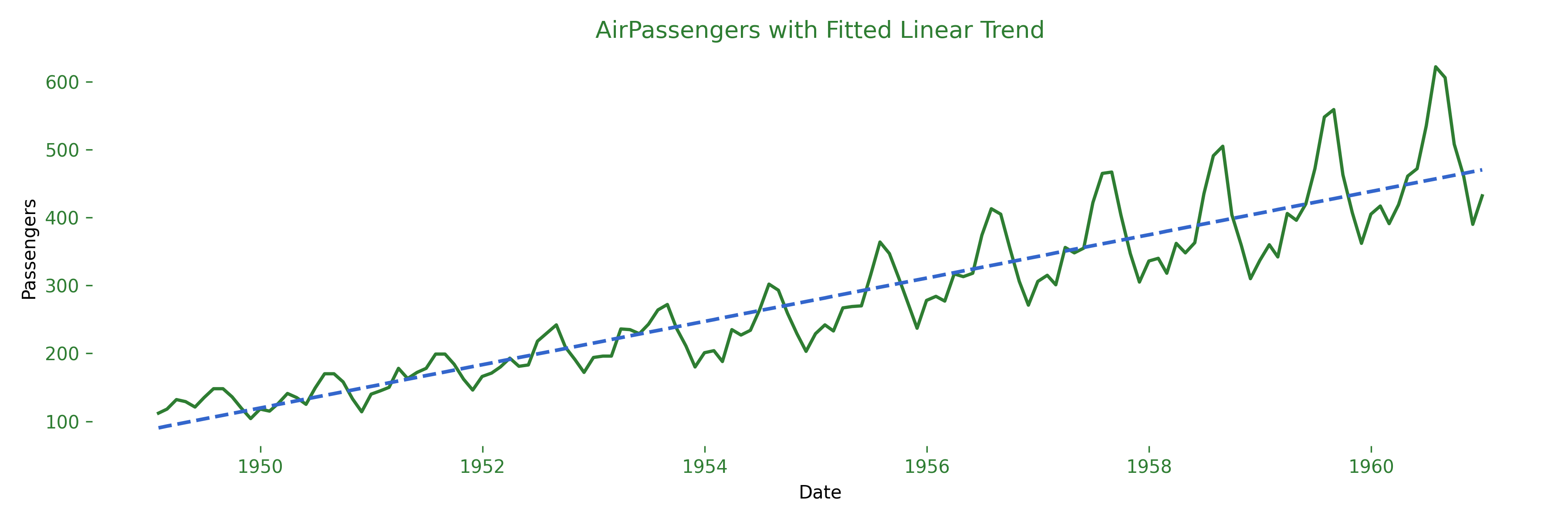
- The dashed line is the fitted trend — notice how neatly it threads the data.
- In a full ARIMA workflow you’d detrend (subtract the line) and deseasonalise (divide by the seasonal factor) before modelling the residuals.
4 · Detrending — stripping out the backbone. Once the fitted trend is removed, what’s left is the detrended series — the part a linear drift cannot explain. If the trend captured most of the long-run movement, the detrended line should hover around a stable level and reveal seasonal pulses even more clearly.
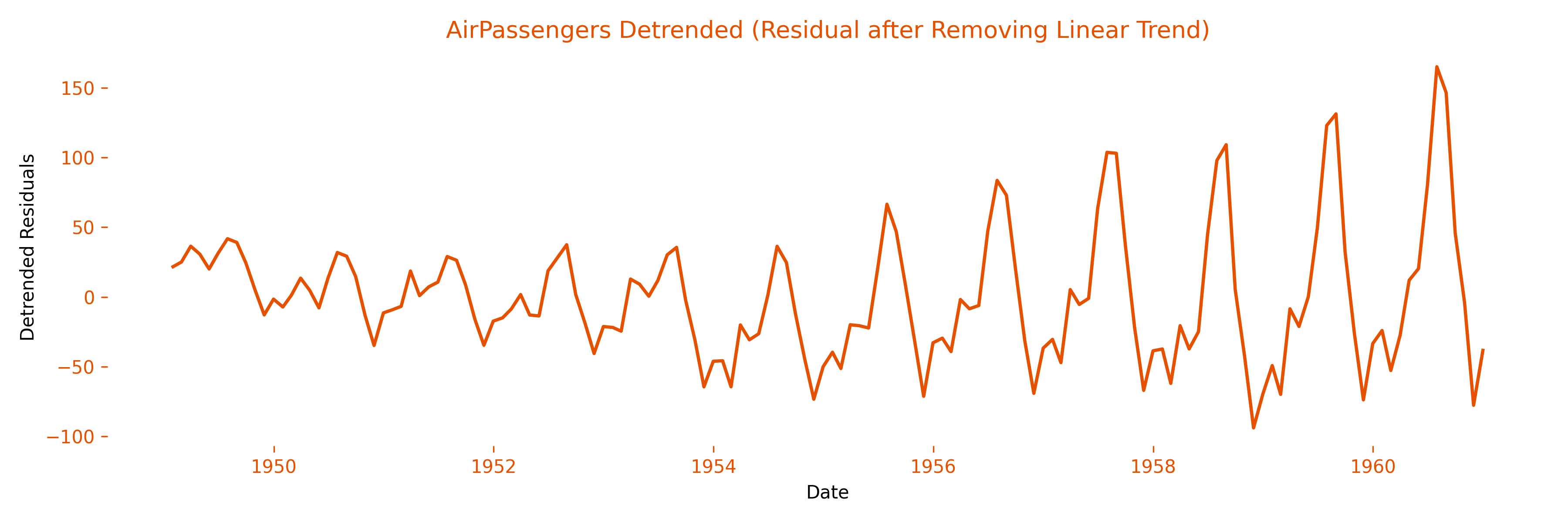
The big upward slope is gone, but the seasonal peaks still march in a 12-month rhythm. This is exactly the state you want before fitting models that assume a stationary mean.
Why bother?
- Trend ≠ signal: many forecasting models stumble on a strong drift.
- Seasonality ≠ noise: it’s predictable and should be modeled, not ignored.
- Residuals: after removing trend and seasonality, any structure left will show up in the ACF / PACF — your roadmap for ARIMA orders.
Quick recap: decomposition shows you what pattern lives in your data; regression quantifies how strong that pattern is. Together they turn a chaotic squiggle into an explainable signal.
Coming Up Next · Blog #3
Foundations in place, it’s time to pick up sharper tools. Blog #3 will take you from eyeballing structure to statistically proving it — and bending it to your forecasting will:
- OLS regression for time series — not just lines, but lines that respect order.
- Inference & diagnostics: t-tests, F-tests, R², plus AIC/BIC for model sanity checks.
- Log transformations — when variance explodes, log it and breathe easier.
- Scatterplots & matrix plots to catch hidden non-linearity at a glance.
- Differencing for linearity — taming curves so linear models bite.
- Dummy variables for sudden policy shifts, pandemics, or holiday shocks.
All wrapped in hands-on code blocks and colour-matched plots, so you can see the math do its magic — and copy-paste it into your own pipeline.
From recognising patterns to quantifying them — see you in Blog #3!